

Key Takeaways
- Paint color changes with daylight, artificial lighting, and nearby surfaces.
- A room's purpose should guide its mood, contrast level, and finish.
- Warm neutrals, muted greens, softened blues, and earthy tones offer flexible starting points.
- Large wall samples provide a more reliable test than a small paint chip.
- Related undertones can connect rooms without making the entire home one color.
- Paint sheen affects both appearance and day-to-day durability.
Choosing an interior paint color involves more than finding a shade that looks attractive on a tiny card. In Kankakee County homes, paint may look different on a bright summer afternoon than it does during a gray winter morning or under evening lamps. The right choice considers light, room size, fixed finishes, and how the space is used every day.
Whether the goal is a calmer bedroom, a more welcoming living room, or a refreshed kitchen, thoughtful interior painting begins with understanding what the room needs to do. A color should support the people using the space, not simply copy a design trend seen online. For those looking for professional guidance, a local interior painting service can provide expert recommendations tailored to your home's specific conditions. Testing a few options in the actual room can also help homeowners see how each color responds to changing light throughout the day.
Start With the Room's Purpose
Each room benefits from a slightly different approach. Bedrooms often feel restful with low-contrast colors such as muted blue, gentle green, warm beige, or dusty rose. Living rooms can accommodate warm whites, soft taupes, earthy greens, and balanced gray-beige shades that pair well with changing furniture and seasonal decor.
Kitchens may suit creamy neutrals, pale greens, or light clay tones that feel comfortable beside cabinetry and counters. Bathrooms can feel clean with white, soft gray, or blue-green shades, while a home office may benefit from muted blue, olive, warm gray, or subdued brown. Before narrowing the options, understanding surface conditions, trim details, and finish needs can help affect the final result. A painting contractor can also help assess these practical considerations and determine how the selected colors and finishes may work on each room's surfaces.
Pay Attention to Natural and Artificial Light
Window direction can change the way a paint color appears. North-facing rooms often receive cooler-looking light, while south-facing rooms generally receive stronger, warmer daylight. East-facing rooms tend to feel brightest in the morning, and west-facing rooms may become warmer later in the day. A soft neutral that seems balanced in one room can appear noticeably cooler or more yellow in another.
Test paint in more than one location, including near a window, on an interior wall, and beside trim or cabinetry. Look at each sample in the morning, at midday, and after lights are turned on. Bulb color also matters because artificial lighting can shift how colors appear. Comparing samples under the lighting most commonly used in the room helps prevent unpleasant surprises after the walls are fully painted.
Use Color Directions as Inspiration
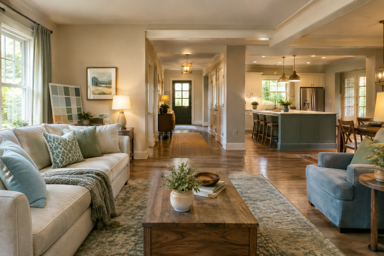
Trends are useful for generating ideas, but they do not need to dictate every decision. Current room-by-room paint color directions for 2026 include warm neutrals, nature-inspired greens, softened blues, and broader accents. These shades can bring visual warmth to a home while still leaving room for personal furnishings, artwork, and wood tones.
Warm off-whites and gentle greiges remain practical choices for shared spaces. A muted olive or weathered blue can create interest without feeling overly intense. Deeper brown, charcoal, plum, or navy may work especially well in rooms where a cozier and more enclosed mood is welcome. The best color is not necessarily the most popular one. It is the one that works with the home's light and existing materials.
Build a Whole-Home Color Plan
A connected home does not require identical walls from room to room. Instead, use related undertones to create flow. For example, a warm off-white in a hallway can connect to a beige living room, a muted green bedroom, and a soft clay-toned dining room when the colors share an earthy warmth.
- Choose one dependable neutral for hallways or larger connected areas.
- Select one or two supporting colors for bedrooms, offices, or bathrooms.
- Reserve stronger colors for smaller rooms, alcoves, built-ins, or accent walls.
- Repeat a few shades through rugs, curtains, pillows, art, or furniture.
- Review the full palette from adjoining doorways before making a final choice.
Know When Light or Dark Colors Make Sense
Light colors can make a room feel open and reflective, particularly when paired with good daylight and lighter furnishings. However, a small room does not always need white walls. Medium and dark colors can add depth, make architectural details stand out, and create a comfortable sense of enclosure.
- Use lighter shades when an airy or open feeling is the priority.
- Choose medium tones when a room feels flat, washed out, or excessively bright.
- Use darker paint in a cozy bedroom, den, powder room, or on a fireplace wall.
- Balance darker walls with lighter trim, textiles, artwork, or furniture when desired.
Choose a Paint Finish That Fits the Room
Paint sheen changes both the appearance and maintenance needs of a wall. Flat and matte finishes generally create a softer look and can reduce the visibility of minor surface imperfections. Eggshell and satin finishes are common choices for active living areas because they offer a subtle sheen and are easier to wipe clean. Semi-gloss and gloss finishes reflect more light and are often used on doors, trim, and selected high-use surfaces.
Because sheen affects reflectivity, test the actual finish under consideration. The same paint color may look softer in matte and brighter in satin. In rooms with uneven walls or strong window light, that difference can be especially noticeable.
Test Before Buying Full Quantities
Paint samples are one of the simplest ways to avoid a costly change of direction. Paint a generous sample directly on the wall or use movable sample boards that can be placed around the room. View the finalists beside flooring, counters, tile, cabinets, and upholstered furniture. Leave samples up through a full day and evening, then compare them side by side rather than relying on memory.
Create Character With Accent Colors
Accent color does not have to mean a single bright wall. It can appear inside built-ins, on a ceiling, across a powder room, or on doors and trim in a related contrasting shade. Recent design coverage has also highlighted color-drenched rooms and dusty hues, which can create depth by carrying a similar tone across walls, trim, and sometimes ceilings.
Common Color-Selection Mistakes to Avoid
- Choosing paint from a phone or computer screen alone.
- Testing only a small patch in one dim corner.
- Ignoring undertones in floors, counters, tile, and cabinetry.
- Using unrelated colors throughout connected spaces.
- Selecting a popular shade without considering the room's light and purpose.
Final Checklist Before Painting
- The room's purpose and preferred mood have been considered.
- Samples have been checked in daylight and artificial light.
- Permanent surfaces and furnishings have been compared with the paint.
- The finish fits the room's level of use.
- Nearby rooms feel connected through color or undertone.
- The final shade feels appealing beyond the current trend cycle.
Conclusion
Choosing interior paint for a Kankakee County home is ultimately about balancing personal preference with the room's lighting, function, existing finishes, and maintenance needs. Testing samples, considering the whole-home palette, and selecting an appropriate sheen can make the final result more predictable and cohesive. Thoughtful preparation allows homeowners to choose colors that remain practical and comfortable over time.

FOLLOW ME ON SOCIAL MEDIA


No comments:
Post a Comment
I love reading and responding to comments but in order to get my reply you must ensure you are NOT a no-reply blogger. If you are, here are some quick steps to change that!
1. Go to the home page of your Blogger account.
2. Select the drop down beside your name on the top right corner and choose Blogger Profile.
3. Select Edit Profile at the top right.
4. Select the Show My Email Address box.
5. Hit Save Profile.